Hey Hey Studios: WordPress & WooCommerce Migration and Custom Development
Hey Hey Studios: WordPress & WooCommerce Migration and Custom Development
Written by

Kharisma Nankani

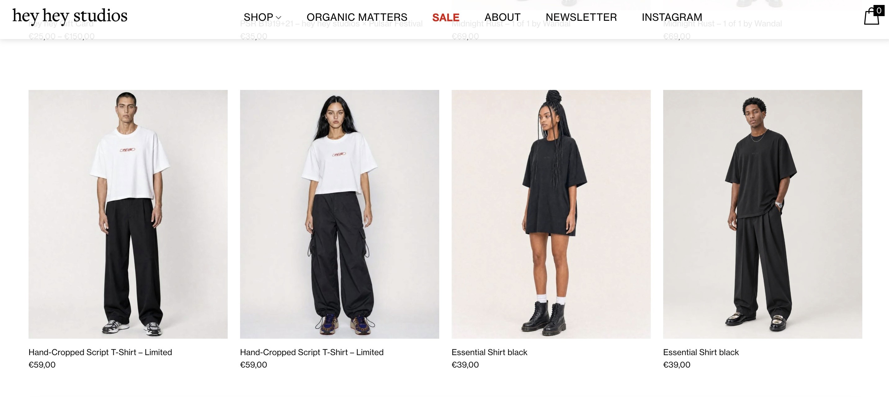
A WordPress and WooCommerce case study covering a theme migration from Lay to Flatsome, custom CSS, JavaScript and PHP development, responsive design refinements, and product functionality improvements.
In this post:
In this post:
Section
Hey Hey: Modernizing an E-Commerce Website with WordPress & WooCommerce
Project Overview
Hey Hey is an e-commerce website where the digital experience plays an important role in presenting products and helping customers navigate the online store.
The project involved migrating the website from the Lay theme to Flatsome, while preserving and refining existing functionality. Beyond the theme migration itself, the work required custom frontend adjustments, responsive layout refinements, and troubleshooting of specific product-related behaviors.
Working directly with the website's WordPress environment, I combined theme configuration with custom CSS, JavaScript, and PHP snippets to address limitations, resolve layout issues, and improve the consistency of the storefront.
The objective was to deliver a stable, functional website that maintained the existing store's requirements while taking advantage of the new theme.
The Challenge
Theme migrations can introduce challenges that go beyond transferring page content. Existing customizations, product behaviors, and responsive layouts may not translate perfectly into a new theme.
For Hey Hey, the main challenges involved several interconnected areas.
1. Migrating between themes
Moving from Lay to Flatsome required checking the website's existing layouts and functionality, then making adjustments to ensure the migrated website continued to work as expected.
2. Preserving custom functionality
Some requirements could not be addressed through theme settings alone. Custom CSS, JavaScript, and PHP were needed to refine specific elements and behaviors.
3. Maintaining a consistent responsive layout
The header and navigation needed careful attention across different screen sizes. In particular, the desktop menu alignment required adjustments to maintain a balanced layout on wider displays.
4. Refining product presentation
Product thumbnails needed consistent heights to create a more orderly product display. The store's size-selection behavior also needed to communicate product availability correctly when certain sizes were sold out.
5. Managing the migration
The migration required a structured review of custom code, plugins, theme behavior, and existing store functionality to reduce the risk of introducing new issues.
The Approach & Solutions
1. Migrating from Lay to Flatsome
The first major task was moving the website to the Flatsome theme.
Rather than treating the migration as a purely visual change, I reviewed the website's layouts and custom functionality and worked through the adjustments needed to make the new theme fit the existing store.
My work included:
Migrating the website from Lay to Flatsome.
Reviewing existing layouts and customizations after the migration.
Adjusting theme-related settings and frontend elements.
Reapplying or refining custom code where the new theme required different handling.
Checking the website's key pages and functionality as part of the migration process.
This required balancing the capabilities of the new theme with the specific requirements of the existing e-commerce website.
2. Custom Frontend Development
Theme settings are useful for standard layouts, but they do not always provide the precision needed for every design or functional requirement.
I used custom CSS, JavaScript, and PHP snippets to extend the website beyond the theme's default behavior.
CSS for layout and presentation
Custom CSS was used to refine spacing, dimensions, alignment, and responsive behavior. These adjustments helped address inconsistencies that could not be resolved through the theme settings alone.
JavaScript for frontend behavior
JavaScript was part of the custom frontend toolkit used to support specific interactive requirements where necessary.
PHP for WordPress customization
PHP snippets provided another way to extend or adjust website behavior within the WordPress environment, particularly where a theme-level or platform-level adjustment was needed.
Using these technologies alongside the theme's built-in functionality made it possible to address specific requirements without relying exclusively on default theme options.
3. Refining the Header & Responsive Layout
The header was one of the areas that required detailed attention.
A navigation layout that appears balanced at one screen width can become misaligned on larger displays. The menu needed to remain visually centered while accommodating the logo and other header elements.
I refined the header styling and responsive CSS to improve menu alignment across wider desktop resolutions, including large monitors and different browser zoom levels.
The work involved testing and adjusting the layout rather than relying on a single fixed configuration.
The broader goal was to create a header that remained consistent and usable across different viewing conditions, while preserving the intended visual hierarchy.
4. Improving Product Display & Availability Logic
Product presentation and selection behavior are particularly important in an e-commerce store. Small inconsistencies can make the shopping experience feel less polished or create confusion about what customers can purchase.
Two areas received specific attention.
Consistent product thumbnail heights
Product images can have different proportions, which may cause product cards to appear uneven when displayed together.
I adjusted the thumbnail styling to create more consistent image heights and a cleaner product grid, improving the visual rhythm of the store.
Sold-out size handling
Products with size variations require clear availability behavior. I worked on the sold-out size logic to address issues with how unavailable options were handled.
This was a functional refinement as well as a visual one: product availability needs to be communicated clearly so customers can understand which options remain available.
Together, these changes helped improve the consistency of product presentation and the clarity of the product-selection experience.
Shared Stock Management Across Gender Categories
One of the more specific challenges involved managing stock for products offered across men's, women's, and gender-fluid categories. Where the same underlying product or SKU was represented across different categories, stock availability needed to remain consistent.
I worked on the stock logic to support shared inventory across these product representations, helping prevent availability from becoming disconnected between categories. This required considering how product variations and inventory were handled within the existing WooCommerce setup.
A Three-Tab Product Information Layout
Product pages needed to present detailed information without overwhelming customers with long blocks of content.
I customized the product information area into three tabs:
Size: Information to help customers understand sizing.
Description: An overview of the product.
Details: Additional product information and specifications.
This structure made product information easier to scan and gave each type of content a clearer place within the product page.
Custom Cart Page
I also customized the cart page to better fit the store's design and shopping flow. Rather than relying entirely on the default WooCommerce presentation, I adjusted the cart experience to align more closely with the website's layout and functionality requirements.
Together, these changes went beyond surface-level styling. They addressed the underlying product and shopping logic that helps an e-commerce store work reliably, while making the customer journey clearer and more consistent.
5. Plugin Updates & Migration Quality Checks
A website migration does not end when the new theme is active. Plugins, custom code, and theme functionality also need to be reviewed to help maintain a stable website.
As part of the maintenance work, I reviewed and updated plugins while accounting for compatibility and potential issues. I also worked through migration checks covering custom CSS, JavaScript, PHP snippets, and the site's key e-commerce behavior.
This process helped identify areas that required further attention after the theme change.
The work reinforced the importance of treating a migration as an ongoing validation process, rather than a single installation task.
Results & Impact
The project combined theme migration, custom development, responsive refinements, and practical e-commerce troubleshooting.
The work focused on four outcomes:
A modernized theme foundation
The move from Lay to Flatsome established the new theme environment for the website, with follow-up adjustments to support its existing requirements.
More consistent responsive layouts
Header refinements addressed menu alignment across different screen widths and browser zoom settings.
Improved product presentation
Adjustments to thumbnail heights helped create a more consistent product grid, while sold-out size logic received targeted functional improvements.
A more thoroughly maintained storefront
Plugin updates and post-migration checks helped address compatibility and functionality concerns as part of the wider maintenance process.
The project demonstrates how a successful theme migration depends not only on the new theme, but also on the custom development and testing needed to make it work for a particular business.
Key Takeaways
This project highlighted the importance of understanding the relationship between a content management system, an e-commerce platform, a theme, and custom code.
A theme can provide a strong foundation, but real-world websites often have specific requirements that need additional development and troubleshooting.
The work brought together several areas of my technical experience:
WordPress and WooCommerce: Working within a content management and e-commerce environment.
Theme migration: Moving from Lay to Flatsome while reviewing existing layouts and functionality.
Frontend development: Using CSS and JavaScript to refine presentation and responsive behavior.
WordPress customization: Applying PHP snippets where additional functionality or adjustments were required.
E-commerce troubleshooting: Improving product presentation and addressing size availability behavior.
Website maintenance: Reviewing plugins and validating functionality after changes.
It also reinforced a practical lesson: small details matter. Header alignment, image consistency, and product availability may appear minor individually, but together they influence how polished and reliable an online store feels.
Conclusion: Beyond the Theme Migration
The Hey Hey project was an opportunity to combine WordPress development, WooCommerce troubleshooting, responsive styling, and hands-on website maintenance.
By migrating the website to Flatsome and addressing specific layout and product-functionality issues, I worked to make the new theme fit the practical needs of the existing store.
For me, this project demonstrates an important part of web development: delivering a useful result often means going beyond the initial implementation to investigate edge cases, refine details, and ensure that the different parts of a website work together.
Explore the website: hey-hey.eu
Hey Hey: Modernizing an E-Commerce Website with WordPress & WooCommerce
Project Overview
Hey Hey is an e-commerce website where the digital experience plays an important role in presenting products and helping customers navigate the online store.
The project involved migrating the website from the Lay theme to Flatsome, while preserving and refining existing functionality. Beyond the theme migration itself, the work required custom frontend adjustments, responsive layout refinements, and troubleshooting of specific product-related behaviors.
Working directly with the website's WordPress environment, I combined theme configuration with custom CSS, JavaScript, and PHP snippets to address limitations, resolve layout issues, and improve the consistency of the storefront.
The objective was to deliver a stable, functional website that maintained the existing store's requirements while taking advantage of the new theme.
The Challenge
Theme migrations can introduce challenges that go beyond transferring page content. Existing customizations, product behaviors, and responsive layouts may not translate perfectly into a new theme.
For Hey Hey, the main challenges involved several interconnected areas.
1. Migrating between themes
Moving from Lay to Flatsome required checking the website's existing layouts and functionality, then making adjustments to ensure the migrated website continued to work as expected.
2. Preserving custom functionality
Some requirements could not be addressed through theme settings alone. Custom CSS, JavaScript, and PHP were needed to refine specific elements and behaviors.
3. Maintaining a consistent responsive layout
The header and navigation needed careful attention across different screen sizes. In particular, the desktop menu alignment required adjustments to maintain a balanced layout on wider displays.
4. Refining product presentation
Product thumbnails needed consistent heights to create a more orderly product display. The store's size-selection behavior also needed to communicate product availability correctly when certain sizes were sold out.
5. Managing the migration
The migration required a structured review of custom code, plugins, theme behavior, and existing store functionality to reduce the risk of introducing new issues.
The Approach & Solutions
1. Migrating from Lay to Flatsome
The first major task was moving the website to the Flatsome theme.
Rather than treating the migration as a purely visual change, I reviewed the website's layouts and custom functionality and worked through the adjustments needed to make the new theme fit the existing store.
My work included:
Migrating the website from Lay to Flatsome.
Reviewing existing layouts and customizations after the migration.
Adjusting theme-related settings and frontend elements.
Reapplying or refining custom code where the new theme required different handling.
Checking the website's key pages and functionality as part of the migration process.
This required balancing the capabilities of the new theme with the specific requirements of the existing e-commerce website.
2. Custom Frontend Development
Theme settings are useful for standard layouts, but they do not always provide the precision needed for every design or functional requirement.
I used custom CSS, JavaScript, and PHP snippets to extend the website beyond the theme's default behavior.
CSS for layout and presentation
Custom CSS was used to refine spacing, dimensions, alignment, and responsive behavior. These adjustments helped address inconsistencies that could not be resolved through the theme settings alone.
JavaScript for frontend behavior
JavaScript was part of the custom frontend toolkit used to support specific interactive requirements where necessary.
PHP for WordPress customization
PHP snippets provided another way to extend or adjust website behavior within the WordPress environment, particularly where a theme-level or platform-level adjustment was needed.
Using these technologies alongside the theme's built-in functionality made it possible to address specific requirements without relying exclusively on default theme options.
3. Refining the Header & Responsive Layout
The header was one of the areas that required detailed attention.
A navigation layout that appears balanced at one screen width can become misaligned on larger displays. The menu needed to remain visually centered while accommodating the logo and other header elements.
I refined the header styling and responsive CSS to improve menu alignment across wider desktop resolutions, including large monitors and different browser zoom levels.
The work involved testing and adjusting the layout rather than relying on a single fixed configuration.
The broader goal was to create a header that remained consistent and usable across different viewing conditions, while preserving the intended visual hierarchy.
4. Improving Product Display & Availability Logic
Product presentation and selection behavior are particularly important in an e-commerce store. Small inconsistencies can make the shopping experience feel less polished or create confusion about what customers can purchase.
Two areas received specific attention.
Consistent product thumbnail heights
Product images can have different proportions, which may cause product cards to appear uneven when displayed together.
I adjusted the thumbnail styling to create more consistent image heights and a cleaner product grid, improving the visual rhythm of the store.
Sold-out size handling
Products with size variations require clear availability behavior. I worked on the sold-out size logic to address issues with how unavailable options were handled.
This was a functional refinement as well as a visual one: product availability needs to be communicated clearly so customers can understand which options remain available.
Together, these changes helped improve the consistency of product presentation and the clarity of the product-selection experience.
Shared Stock Management Across Gender Categories
One of the more specific challenges involved managing stock for products offered across men's, women's, and gender-fluid categories. Where the same underlying product or SKU was represented across different categories, stock availability needed to remain consistent.
I worked on the stock logic to support shared inventory across these product representations, helping prevent availability from becoming disconnected between categories. This required considering how product variations and inventory were handled within the existing WooCommerce setup.
A Three-Tab Product Information Layout
Product pages needed to present detailed information without overwhelming customers with long blocks of content.
I customized the product information area into three tabs:
Size: Information to help customers understand sizing.
Description: An overview of the product.
Details: Additional product information and specifications.
This structure made product information easier to scan and gave each type of content a clearer place within the product page.
Custom Cart Page
I also customized the cart page to better fit the store's design and shopping flow. Rather than relying entirely on the default WooCommerce presentation, I adjusted the cart experience to align more closely with the website's layout and functionality requirements.
Together, these changes went beyond surface-level styling. They addressed the underlying product and shopping logic that helps an e-commerce store work reliably, while making the customer journey clearer and more consistent.
5. Plugin Updates & Migration Quality Checks
A website migration does not end when the new theme is active. Plugins, custom code, and theme functionality also need to be reviewed to help maintain a stable website.
As part of the maintenance work, I reviewed and updated plugins while accounting for compatibility and potential issues. I also worked through migration checks covering custom CSS, JavaScript, PHP snippets, and the site's key e-commerce behavior.
This process helped identify areas that required further attention after the theme change.
The work reinforced the importance of treating a migration as an ongoing validation process, rather than a single installation task.
Results & Impact
The project combined theme migration, custom development, responsive refinements, and practical e-commerce troubleshooting.
The work focused on four outcomes:
A modernized theme foundation
The move from Lay to Flatsome established the new theme environment for the website, with follow-up adjustments to support its existing requirements.
More consistent responsive layouts
Header refinements addressed menu alignment across different screen widths and browser zoom settings.
Improved product presentation
Adjustments to thumbnail heights helped create a more consistent product grid, while sold-out size logic received targeted functional improvements.
A more thoroughly maintained storefront
Plugin updates and post-migration checks helped address compatibility and functionality concerns as part of the wider maintenance process.
The project demonstrates how a successful theme migration depends not only on the new theme, but also on the custom development and testing needed to make it work for a particular business.
Key Takeaways
This project highlighted the importance of understanding the relationship between a content management system, an e-commerce platform, a theme, and custom code.
A theme can provide a strong foundation, but real-world websites often have specific requirements that need additional development and troubleshooting.
The work brought together several areas of my technical experience:
WordPress and WooCommerce: Working within a content management and e-commerce environment.
Theme migration: Moving from Lay to Flatsome while reviewing existing layouts and functionality.
Frontend development: Using CSS and JavaScript to refine presentation and responsive behavior.
WordPress customization: Applying PHP snippets where additional functionality or adjustments were required.
E-commerce troubleshooting: Improving product presentation and addressing size availability behavior.
Website maintenance: Reviewing plugins and validating functionality after changes.
It also reinforced a practical lesson: small details matter. Header alignment, image consistency, and product availability may appear minor individually, but together they influence how polished and reliable an online store feels.
Conclusion: Beyond the Theme Migration
The Hey Hey project was an opportunity to combine WordPress development, WooCommerce troubleshooting, responsive styling, and hands-on website maintenance.
By migrating the website to Flatsome and addressing specific layout and product-functionality issues, I worked to make the new theme fit the practical needs of the existing store.
For me, this project demonstrates an important part of web development: delivering a useful result often means going beyond the initial implementation to investigate edge cases, refine details, and ensure that the different parts of a website work together.
Explore the website: hey-hey.eu
Building smarter digital experiences.
I combine AI, automation and web development to turn ideas into useful digital products.